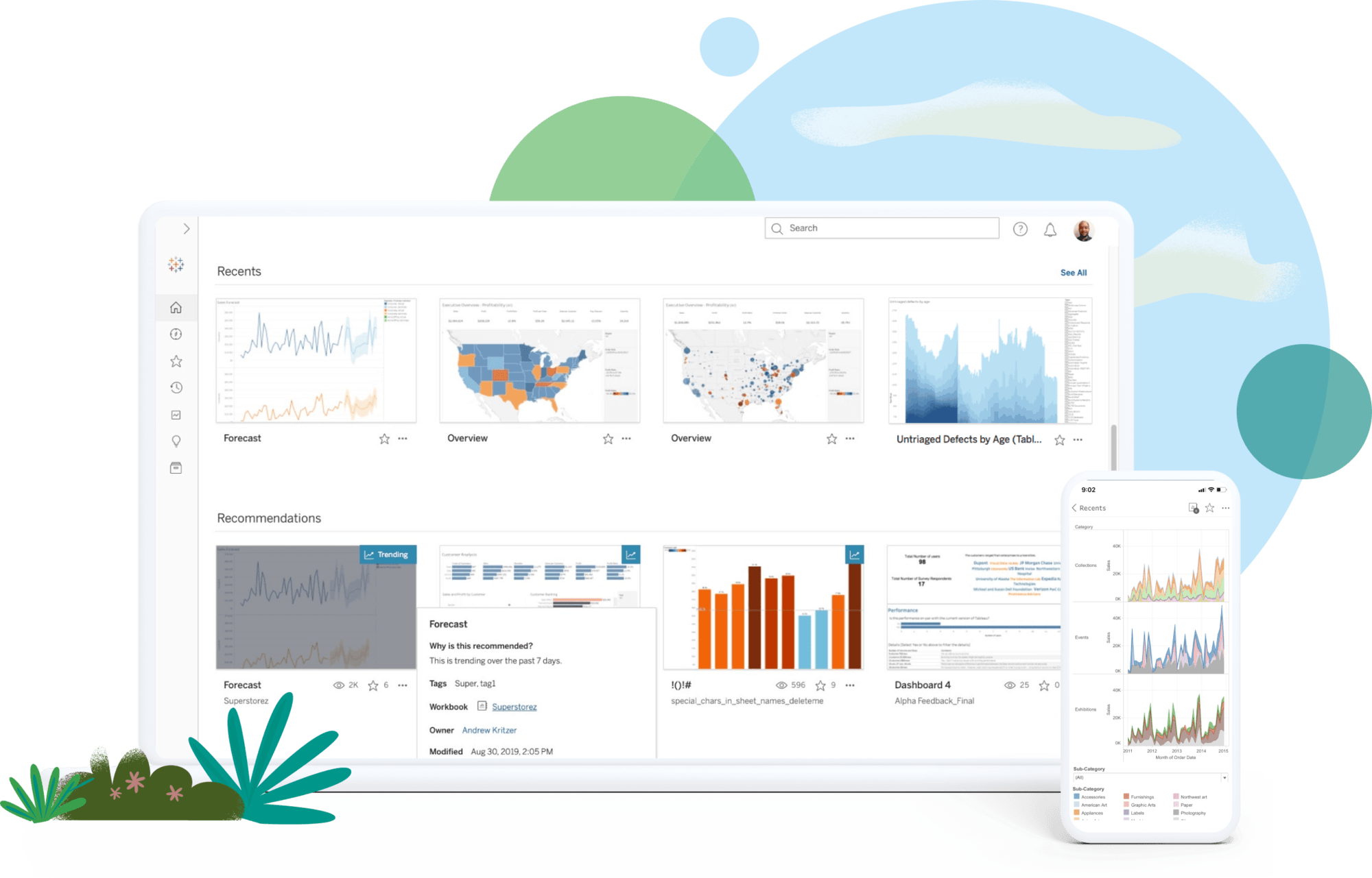
Tableau
At least 50% off from FlexSub
Subscribe Now
Introduction
Frequently, we must be able to edit and display our results visually in order to fully comprehend the significance of our data. As humans interpret images far better than text, by giving charts and graphs, we are frequently able to comprehend the significance of data more rapidly. We may begin to comprehend the significance of data clusters in relation to the overall dataset and discover trends as they emerge.
In a marketing business, we may have a list of figures or an aggregated table of our data, such as the number of women between the ages of 35 and 45 who purchased X product in New Jersey. We may know the actual number and the percentage of the whole population, but with a business intelligence tool, we can alter this data in real time to determine which factors influence others without having to perform tedious manual computations.
Tableau is a suite of business tools designed specifically for rapidly extracting information from data, creating dynamic visual representations, sharing with teams or others via presentation, and eventually publishing these tools to a website or API.
The Suite of tools contained within Tableau includes:
- Tableau Desktop – Data Visualization and graphing tool
- Tableau Prep – ETL tool for preparing data for analysis
- Tableau Online – for sharing and collaboration
- Tableau Server – for publishing the results to the web.
For the purposes of this review we will be focusing on Tableau Desktop, with some brief discussion of how it integrates with Tableau Online and Tableau Server. (Tableau Prep is a separate piece of software and will be covered in a future review)
Features
We will examine Tableau's capabilities from the standpoint of a marketing campaign. Suppose we have a list of existing consumers in many states, each of whom has purchased a wide variety of things, and we want to have a deeper understanding of how and by whom these purchases have been made.
Data Preview
Tableau allows you to load a simple Excel file or CSV including some basic data regarding your customer list. You can see a quick preview of the first 1000 lines with a single click. Data is sortable, and you can see that various data types are already recognized, and formatted accordingly
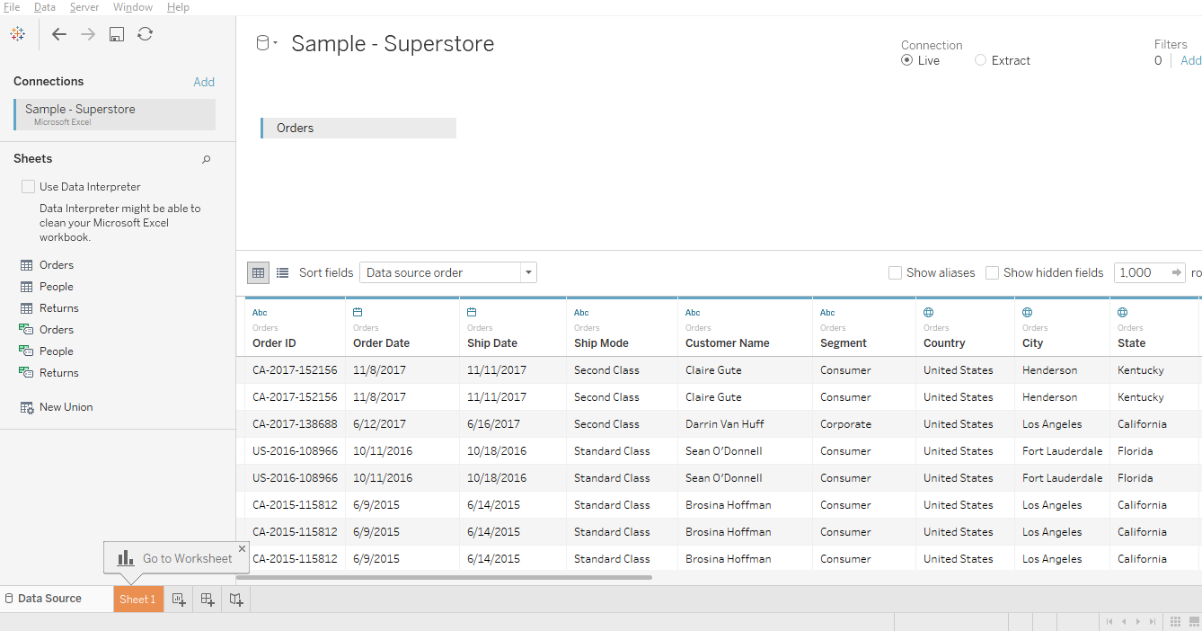
Table Creation
The data in your columns is listed in a menu on the left side of the screen. By dragging a few items into a column and/or row, you can create a quick pivot and get a clear summarization of your data. For instance, by choosing “year” and dragging into the column field, and then state into the row field, and grabbing sum and dragging this into the center, we can get a quick summary like this:
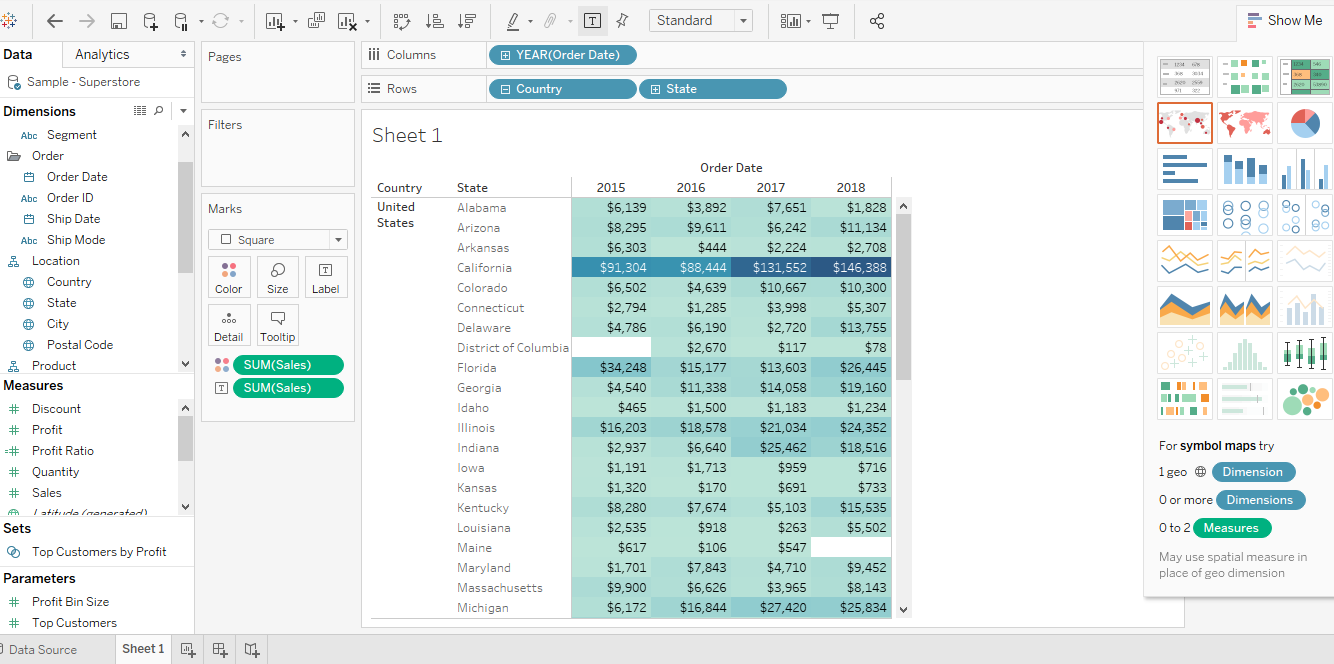
You can zoom in on any individual data entry and get more detail.
Filters and graphing
A menu on the right makes it simple to select from a vast choice of accessible charts. These are built automatically and dynamically with minimal or no user participation.
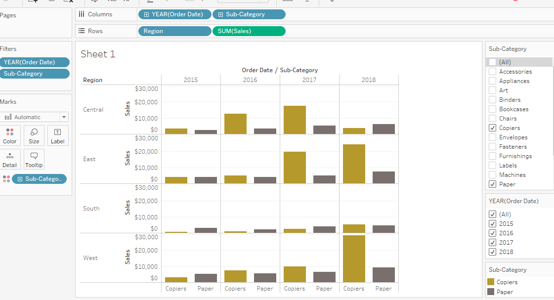
You can rapidly filter your data to isolate small subsets of data so that you may view certain details. For instance, we can evaluate the link between two potentially related objects below (copiers and paper). Oftentimes, we are able to perceive things that may not be immediately apparent or conform to our previous assumptions, which enables us to develop novel ways of examining our data. In this instance, the amount of paper used did not grow proportionally with the number of photocopiers purchased, indicating that the two variables are not necessarily correlated, except for a modest correlation over time.
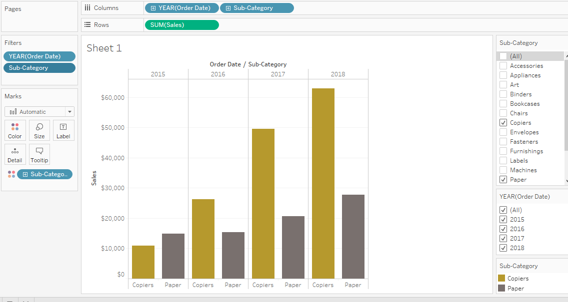
Note that while using filters, changes are cumulative, so Tableau appears to continually add new parameters. Tableau makes assumptions about the type of data you are dealing with, and these assumptions may not yield the types of analyses you want or need, so it is crucial to create your charts with caution. Data representation can be affected by the sequence in which filters are provided.
There does not appear to be a method to modify specific steps without undoing and redoing filters and graphing, which can be somewhat perplexing.
Variety of Charting functions
You are given a wide variety of tools for organizing data. For example, below is a summary of sales broken down by regions of the country and year.
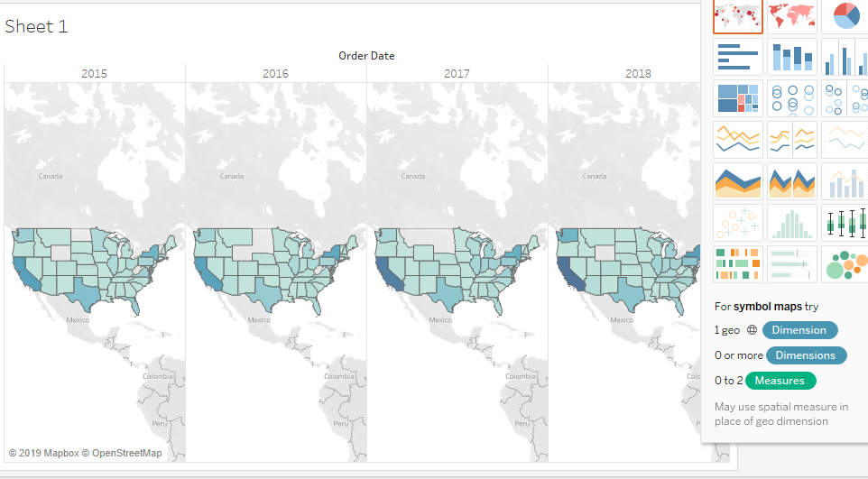
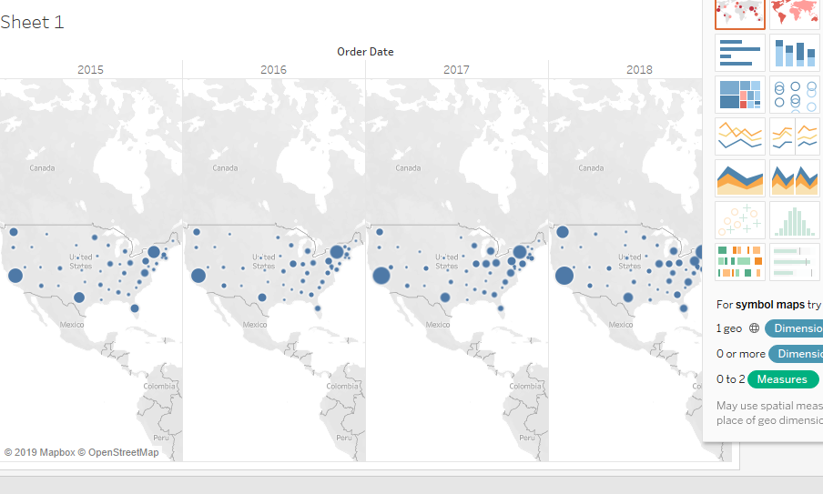
Geographic Features
For mapping data, Tableau has a number of built-in features. It automatically recognizes state names as geographic entities, and includes some predefined “regions” within the US (e.g. south, west, central, east). It also stores longitudinal and latitudinal data for cities and states to make it possible to quickly map data.
Here are a few examples of the sorts of charts one can generate, based on the data we provided earlier:
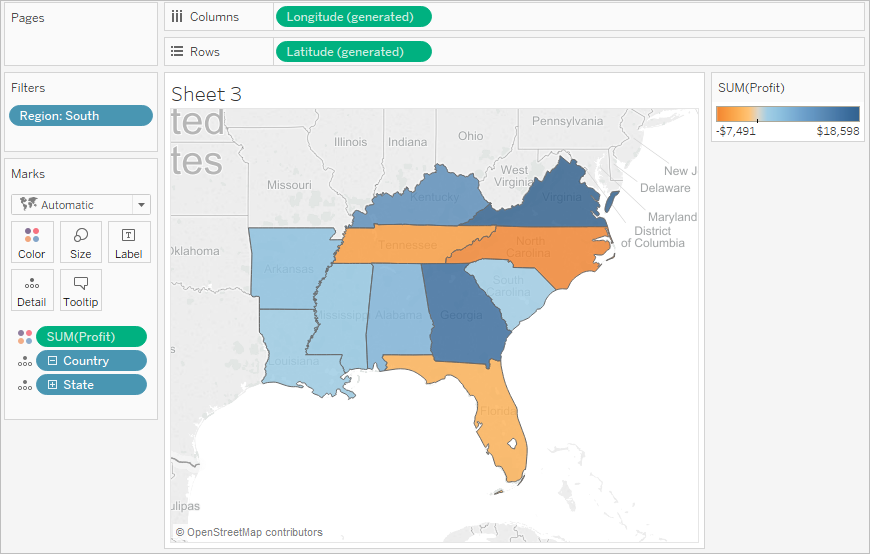
When zeroing in on certain regions, you can create color coded “heat maps” of where the strongest concentrations of data lie. For instance, in the below map of the “southern” region of the US, blue represents profitable areas. The darker the color, the greater the level of profit. Areas in orange represent losses, and similarly, darker orange colors represent greater loss.
Dashboard
One of the most useful features in Tableau is the ability to quickly create multiple dashboards to be able to view multiple different types of data together. These can help both with analysis and presentations, which can help us generate “stories” and can help us walk through data interactively in meaningful ways.
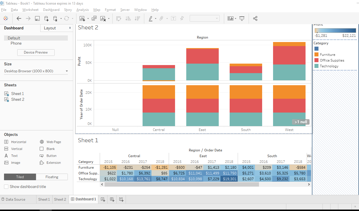
These dashboards can be helpful for individual users to for personal edification of theories, or for creating presentations for other users.
Presentations
Presentations can be put together using various dashboards, and with interactive slides. By putting together your data to tell a story, you enable your audience to visualize and understand how various aspects of data interact with each other. You can simply display data, and make real-time modifications directly in front of your audience to demonstrate in clear fashion what causes what.
Sharing findings
Once you have constructed information to make your point, Tableau provides the ability to share your findings with other interested parties.
Tableau Public
For interacting directly with a team, one can easily share information between different users and workstations. Results can be embedded directly into web pages, so presentations can happen remotely.
Tableau Server
When data is ready to be publicly delivered, Tableau Server will hold all workbooks, presentations, analytics and dashboards for when they are ready to be delivered to the public through a website. It’s important to note that while Tableau has its own server, it supports connections to pretty much any other database server and has a wide variety of integrations.
Summary: Key Takeaway
Depending on its intended application, Tableau can be a beneficial piece of software for direct marketing organisations. Its strengths lie in its end-user data displays. Tableau is a wonderful tool for dealing with data to develop stories and presentations.
However, it falls short as a business intelligence tool for huge businesses. The fact that the basic edition lacks built-in report scheduling features makes it a weak option for enterprise-level dashboards. Its best application is as a desktop tool that works well with a variety of conventional office applications, such as word processors, spreadsheets, and presentation software.
Tableau
At least 50% off from FlexSub
Better, flexible and cheaper subscriptions for a wide range of services in just a click of a button.
Get started now