Figma and Sketch and Axure
At least 50% off from FlexSub
Subscribe Now
In a recent Toptal infographic titled "The Best UX Tools," we examined the wide range of digital design tools on the market, the majority of which are capable of assisting the individual UX designer in their day-to-day tasks.
Three of the featured tools, Sketch, Figma, and Axure, have devoted followings because they excel at specific tasks in the UX design workflow.
The performance of these tools, however, varies depending on the design task at hand. Instead of listing all of their features in a comparison table, we'll use a task-based review to determine their effectiveness.
Here’s a quick overview of the competitors:
- Sketch by Bohemian Coding based in Hague, NL. Sketch is a Mac-only application.
- Figma by Figma based in San Francisco, California. Figma runs on any operating system via a browser.
- Axure by Axure Software Solutions based in San Diego, California. Axure has a Windows and Mac version.
We’ll score each tool based on how well it performs everyday design tasks out of the box—without plugins, add-ons, or third-party apps. The tasks include:
- Doing Concept Ideation
- Creating Low-Fidelity Deliverables
- Creating High-Fidelity Deliverables
- Creating Interactive Prototypes
- Creating a Design System
- Delivering to Development
Note: When the tools have nearly identical features needed to complete a task, the win will go to the tool that is easier to use and provides faster delivery. If that determination seems too close to call, third-party support is the tie-breaker.
Task: Doing Concept Ideation
Ideation is a creative process for generating new ideas that is typically carried out by interdisciplinary teams of designers, developers, product owners, and project managers.
The goal is to come up with new ideas for products after taking into account the basic requirements and any existing work. A team, for example, may go through a concept ideation session to develop a set of MVP features for a new app—or next-generation features in an existing app.
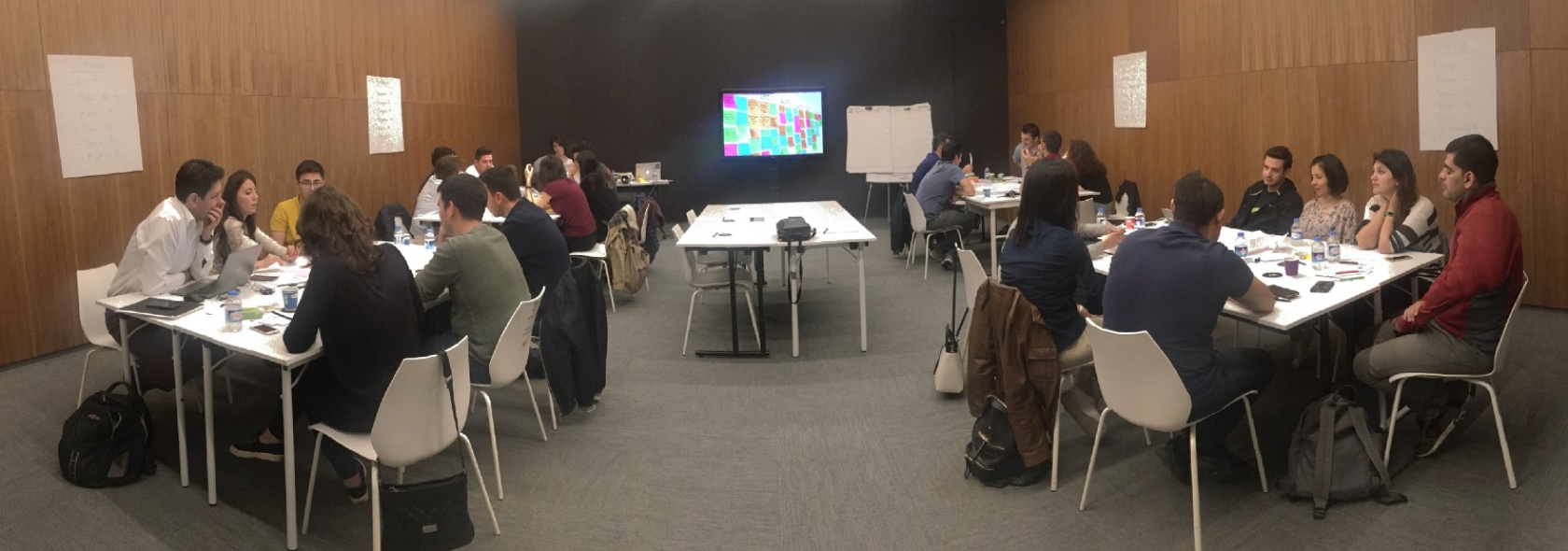
Many designers generate concept ideas on a whiteboard or on paper. However, ideation is done digitally as well, particularly in distributed offices. Non-designers such as product owners/managers and front-end developers participate in concept generation as a team sport. The best tools for this task are those that promote collaboration and are simple to use.
Winner: Figma
Both Sketch and Axure provide cloud sharing services, but there is no way to share screens with collaborators in real time.
Figma files can be joined in real time, and each participant's labelled cursor is visible. A click on a representative avatar in the toolbar switches views to that person's point of view, making it simple to quickly share an idea. Furthermore, non-designers do not need to own a copy of Figma; they simply open the file link and begin working.
Other whiteboard collaboration tools, such as Mural and Realtimeboard, may be better suited for concept ideation than Figma, but as a design tool, Figma far outperforms Sketch and Axure.
Task: Creating Low-fidelity Deliverables
Low-fidelity deliverables are typically created in the form of wireframes or digital sketches that can be distributed and reviewed by other designers and product owners. They may also be viewed by developers and other stakeholders, depending on the UX process.
Wireframes are used to demonstrate the basic structure of an app so that the interaction model can be defined before devoting time to creating high-fidelity mockups.
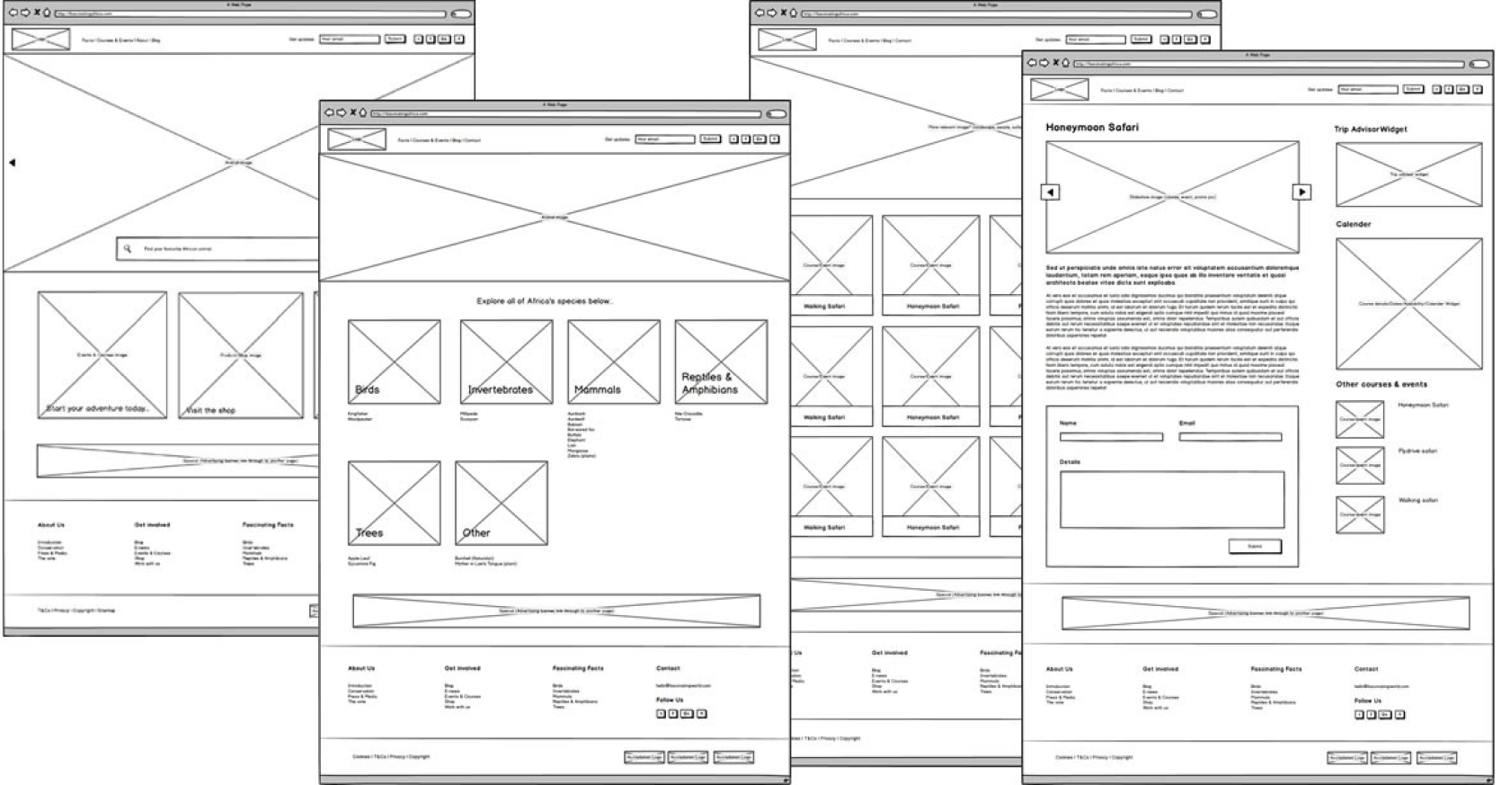
Lo-fidelity wireframes can be created using tools dedicated to the task, such as Balsamiq Mockups, Moqups, and FluidUI. However, Sketch, Axure, and Figma are all capable of performing the same function, particularly when users create wireframe component libraries.
Because wireframes are typically used as the first UI layout for an app or page, they are monochromatic rough cuts that change frequently. This helps to manage stakeholder expectations.
The ease of use, speed of delivery, and modification of wireframes are critical because they allow designers to produce variant designs efficiently.
Winner: Axure
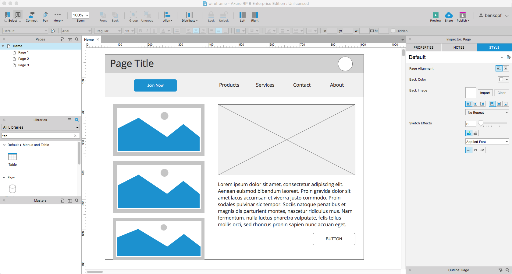
Axure wins this round because it includes pre-packaged components for wireframing right after installing the software. Wireframes can be created in Sketch and Figma, but you must either draw them yourself or download a file that contains them. They must be integrated into a symbol (Sketch) or component (Figma) library before they can be dragged and dropped like Axure components.
Axure has a plethora of third-party libraries for creating low-fidelity deliverables, Sketch has a plethora of free and paid files that can be downloaded, and Figma's public resources are still in their infancy.
The three tools are evenly matched once a designer has created wireframe component libraries. Although Axure's components have parametric and adjustable properties, all three tools perform well for static wireframes when the libraries are available.
Task: Creating High-fidelity Deliverables
High-fidelity deliverables are born from the feedback and learnings gathered from low-fidelity wireframes. They are mockups that show color, visual detail, and proposed final designs for an app.
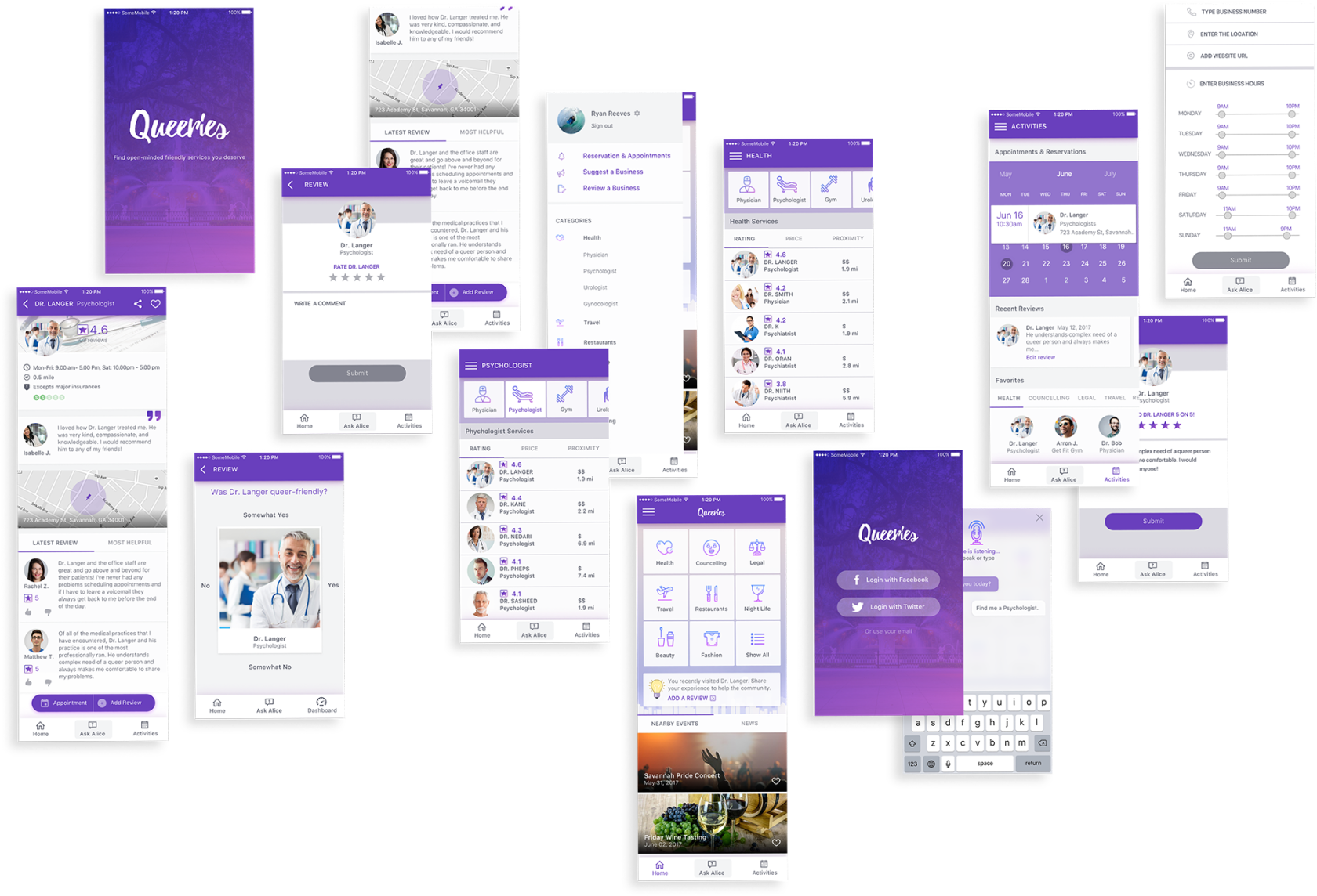
High-fidelity screen mockups are also ready for presentation and are shown to clients, internal executives, and other non-designer stakeholders. Design tools that excel at this task include all of the features required to add the polish required to create a representation of final customer-facing deliverables.
Controlling object fills and strokes, adding effects like shadows and gradient fills, and exporting art into an easily digestible format are all part of this (png, pdf, jpg).
Winner: Figma
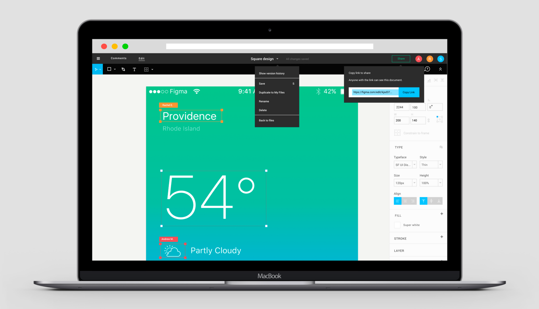
Figma and Sketch have nearly identical tool sets for creating high-fidelity mockups, but Figma's interaction model is more refined and the tool is easier to use right away. Both tools provide quick access to advanced editing and boolean functions like Join, Intersect, Union, and Subtract. While Sketch's plugin support allows third-party developers to create additional features, these tools are not immediately available after installation.
Custom object creation is available in all three tools, but Axure makes it somewhat difficult to access the commands. The aforementioned edits are not available on the toolbar. When multiple objects are selected, access is only granted via the context menu.
Figma's vector networks also make working with line tools a breeze.
Task: Creating Interactive Prototypes
Interactive prototypes can be as crude as a paper prototype or as detailed as a branched version of an existing app that has been altered to explore new features. Typically, interactive prototypes allow users to navigate from screen to screen and employ functionality such as menus and lists.
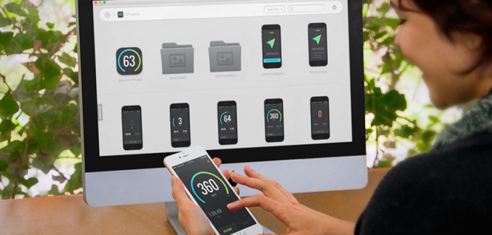
A simple interactive slideshow will suffice for many designers when presenting their work. This is particularly true for mobile apps, where simple transitions provide sufficient device interaction to explain the design.
Because Figma is a real-time cloud-based app, there is no need to refresh HTML pages when a file is updated.
Stakeholders may occasionally request live data connections to load a prototype with real-world data in order to test a design's scalability, but the vast majority of designers now have little need for complex prototypes.
Winner: Figma
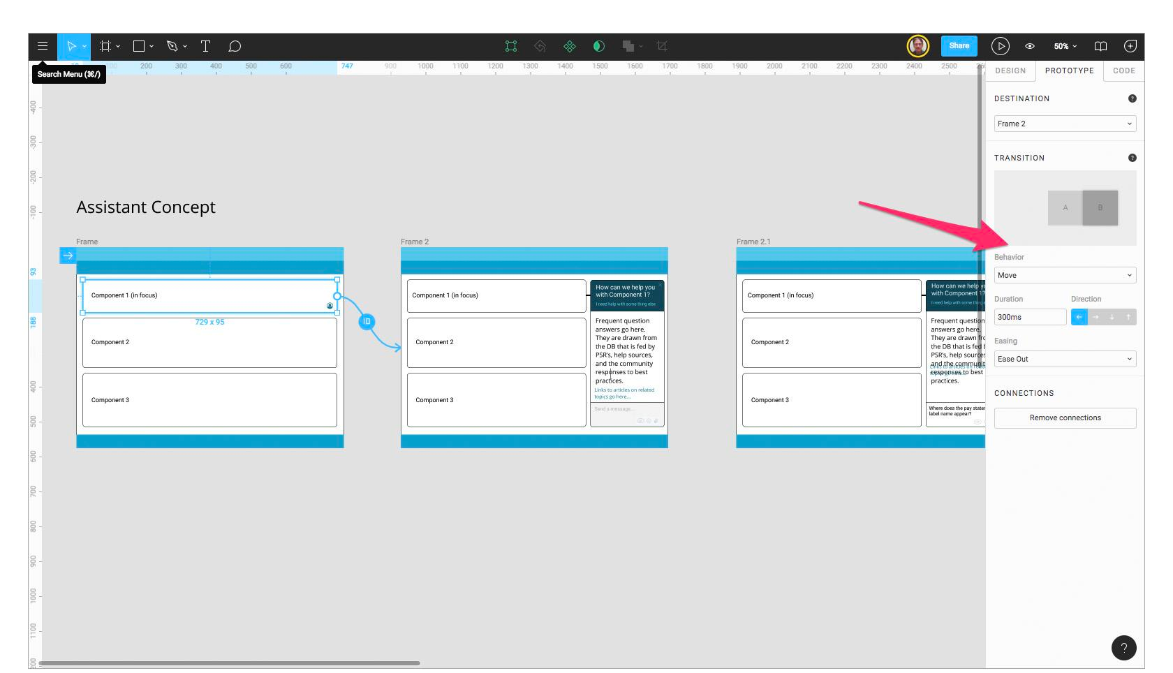
Sketch and Figma both allow for basic prototyping via "object to artboard" linking and a limited set of transitions. Plugins help to supplement Sketch's basic prototyping capabilities, but Axure is the most powerful when it comes to providing a robust interaction model for prototypes.
Winner: Figma
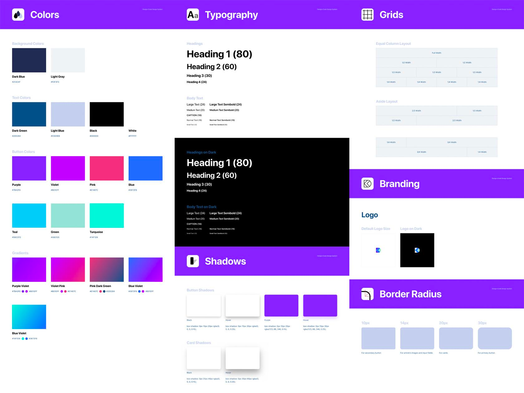
While component libraries can be built in any of the programmes, none of them allow designers to flip a switch and immediately produce a viable component library. Axure can create an HTML page with custom components, but there is no way to query the single component to find out its colour value, size, and other properties.
Creating a design system with any of these tools remains a manual process. However, there are Sketch plugins (such as Google's recently released Material Design plugin) and at least one third-party Figma tool in the works.
Figma wins because a good design system is built on collaboration. Employees from various departments (design, development, quality, and content) will need access to a design system library, and many will be adding to the design component file that syncs to the shared library. Anyone, not just licence holders, can use Figma, making it simple to access and add to a shared file.
Task: Delivering to Development
When UI designers complete an interface, it is their responsibility to pass design files to developers so that the project can be completed. However, a handoff is more than just a data exchange; it is an opportunity for designers to communicate the rationale of their work and thus assist developers in marrying form and function.
To facilitate redlining and object information queries from Sketch and Figma files, there are dozens of handoff methods and even more third-party tools (see Avocode and Zeplin). In this comparison, however, we're looking at the original design tool before it's been supplemented with plugins or other apps.
Surprisingly, the rise of UX design systems reduces the need for this type of handoff, as published component libraries serve as the developer's single source of truth. They can get the exact layout and design information of the components without having to wait for a deliverable or a UX consultation.
Obtaining information from objects in a design file can also be useful during the construction of a design system, so some understanding of CSS is beneficial.
Although Sketch allows you to select objects and use a contextual menu to "Copy CSS Attributes," it is not ideal. Figma does a good job of producing CSS, iOS, or Android values for selected objects by including a "Code" tab in the properties panel (developers can use this feature in view-only or prototype mode).
Winner: Axure
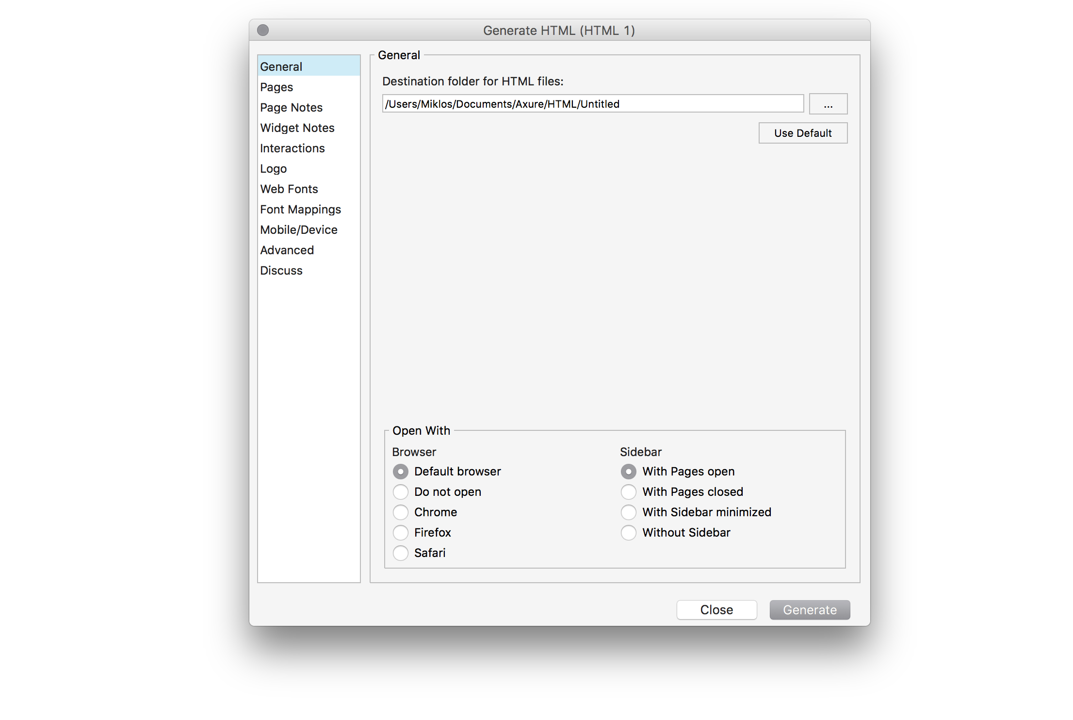
Only Axure has powerful "generators" that produce fully publishable HTML files, Word Specifications, and even CSV formatted reports to import into a spreadsheet at this time. While the app does not produce a design library, it does provide useful developer handoff materials.
The Overall Design Tool Winner: Figma
According to the numbers, Figma wins this comparison, owing to its collaborative nature and cross-platform availability. Figma's real-time collaboration and live embedding feature give it a significant advantage as more teams use design systems that require tighter integration across front-end development and design. Figma, on the other hand, is an online application that, for security reasons, may be prohibited from use in an enterprise.
Axure comes in second due to its out-of-the-box strength with pre-built components, powerful interactive prototyping features, and document generation. Axure is the best or only option when a company needs to access real-world data stores to see how a particular feature behaves.
Although Sketch came in last, once users take advantage of the many plugins and resources available for the tool, it becomes extremely powerful and can be tailored to meet the needs of a design group. The catch here is that plugins must be updated after each Sketch update, and because it is a Mac-only application, businesses using Windows PCs cannot use it.
All three of the tools discussed in this article are extremely effective in their own right. Each, however, has limitations. Individual designers and teams must identify their workflow requirements, weigh the pros and cons of each programme, and make an appropriate decision.
Figma and Sketch and Axure
At least 50% off from FlexSub
Better, flexible and cheaper subscriptions for a wide range of services in just a click of a button.
Get started now
